Tuesday, September 30, 2008

Statistical Map

personalpages.manchester.ac.uk/.../census.html

A statistical map is a map that is used to display the distribution of a certain variable over a particular geographic areas. This map is a statistical breakdown of Internet and email connectivity by country. The purple countries have full Internet connectivity and the green have only email capability. The few yellows have no connectivity at all.

Cartogram of World


A Cartogram is a map that focuses mainly on showing area or distance measurable proportional to the size of the areas on the map in contrast to each other. For example, this map is a world map that show the population of each country. What makes it a cartogram is that the countries with the most people are the biggest on the map with no relation to how big it is in actual land mass.

Flow Map of Cali and NY

graphics.stanford.edu/papers/flow_map_layout/

A flow map shows traffic patterns and flow from one place to another or many places. This is a flow map using different colors and line thickness to show the top 10 states of people that migrate to California and New York. It gives an idea of the variety of people and volume that travel between those areas.

Isoline Map of MAUI!!!

www.esri.com/news/arcwatch/0207/feature.html

An isoline map is a map with continuous lines joining points of the same value. In this map of Maui, Hawaii the rainfall isolines are displayed with contour lines and the different colors on the satellite image that show annual rainfall in the area.

Monday, September 22, 2008

proportional circle map

www.neiu.edu/~ejhowens/377/examples.htm

A proportional circle map is a map that displays data in relation to the size of the circles that are shown on the map. This is a map of that shows the population of Mexicans in the United States in 1990. The biggest circles are in Texas and California and correlate with Those two states having the highest Mexican population.

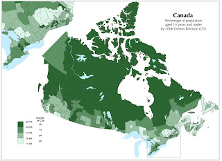
choropleth map of Canada

www.statcan.ca/.../figures/figure3.1-en.htm

A choropleth map is a thematic map that is used to show a measurement of some sort by use of shading and/ or patterns. It provides the viewer an easy way to translate statistics to and from a map by use of the colors and patterns used. This is a choropleth map of Canada and show the percentage of population that are under age 14 in 2006. The lighter areas are for less percent and the darker areas are for higher percent.


Monday, September 15, 2008

Dot Distribution Map

www.brocross.com/dfly/species/cyanea.htm

The main purpose of a dot distribution map is to show population or how much of something is in a particular area on a map using dots. This particular map is taken from a study of an insect and it's breeding habits. The large dots show proven breeding, the medium dots show probable breeding, and the small dots show possible breeding.

Propaganda Map during wartime

www.psywarrior.com/sexandprop.html

This is an attempt to use sex and persuasion together in a postcard from the 1940's.A propaganda map's main purpose is to try to persuade or send a message. During the 1940's there was a lot of use of propaganda maps by the US, Russian, China, Germany, Korea and so on to try to intimidate opposing countries and their soldiers. The link provided is very educational and interesting to just how this was done. However, there is a lot of graphic images, so be forewarned.

Hypsometric map of Canada


www.maps.com/map.aspx?pid=1312

This is a hypsometric map of Canada with some of the Northern United States, Alaska, and Greenland also shown. A hypsometric map is a map that shows elevation and contours through shading, tinting, and sometimes batching. It's main purpose is to show relief of the land through these means.

http://www.answers.com/topic/hypsometric-map

Monday, September 8, 2008


A PLSS, or Public Land Survey System, is a map that is used mostly to facilitate land ownership. It uses a division method of Townships that break down into grids, lots, and sections that are structured around different surveys. This image is taken from a website that shows different PLSS maps and how to use and read them. This PLSS is of Alabama and the blue part is the Franklin County Townships.

Cadastral map


http://freepages.history.rootsweb.ancestry.com/~exy1/gracemere/images/Gracemere_cadastral.jpg

http://images.google.com/imgres?imgurl=http://freepages.history.rootsweb.ancestry.com/~exy1/gracemere/images/Gracemere_cadastral.jpg&imgrefurl=http://freepages.history.rootsweb.ancestry.com/~exy1/gracemere/maps.html&h=496&w=641&sz=148&hl=en&start=34&usg=__JjChuGGRt7vBa_8SJ5hqIB0WNcA=&tbnid=rqG_elJdGZBbFM:&tbnh=106&tbnw=137&prev=/images%3Fq%3Dcadastral%2Bmaps%26start%3D18%26gbv%3D2%26ndsp%3D18%26hl%3Den%26sa%3DN

This map was taken from an ancestry website. Although the detail is not given, is presents itself as a cadastral map of a families land breakdown in a certain area. A Cadastral map is a map that that basically shows boundries and ownership of land parcels.

Thematic map of population


http://images.google.com/imgres?imgurl=http://www.lib.wsc.ma.edu/themap.jpg&imgrefurl=http://www.lib.wsc.ma.edu/censusaff.htm&h=381&w=505&sz=36&hl=en&start=2&usg=__hqgN0t4ZzGISnG3TyTMxDe6G_Ak=&tbnid=lfQhH-KYeLkvyM:&tbnh=98&tbnw=130&prev=/images%3Fq%3Dthematic%2Bmaps%26gbv%3D2%26hl%3Den%26sa%3DG

http://www.lib.wsc.ma.edu/themap.jpg

This is a thematic map of the median age of population from state to state in the Northeastern and Midwestern United States. Thematic maps are used for focusing in one one or a few particular geographic distributions. For example, on a normal reference map there may be 10 different breakdowns, while a thematic map may take 1 or 2 of those things and give more detail about them on a map.

Sunday, September 7, 2008

Topographic map of Mountainous Region


http://www.compassdude.com/i/topo-map-close.jpg
http://images.google.com/imgres?imgurl=http://www.compassdude.com/i/topo-map-close.jpg&imgrefurl=http://www.compassdude.com/topographic-maps.shtml&h=272&w=500&sz=23&hl=en&start=184&um=1&usg=__Hbu6HBbL3ldgkgsOSjsYu45_N_s=&tbnid=KS46tSRVTb57cM:&tbnh=71&tbnw=130&prev=/images%3Fq%3Dtopographic%2Bmap%26start%3D180%26ndsp%3D20%26um%3D1%26hl%3Den%26sa%3DN

This is a topographic map of Mt. Passaconway and Mt. Tripyramid with the surrounding elevations. The lines in the image are called contour lines and indicate changes in elevation. This image is meant to be viewed as 3-d in some respects because of the way the elevation is charted.

Plaimetric map of Hospital


http://www.spatialdc.com/projects/images/rexhospitalplan.jpg

http://images.google.com/imgres?imgurl=http://www.spatialdc.com/projects/images/rexhospitalplan.jpg&imgrefurl=http://www.spatialdc.com/projects/hospitals.htm&h=284&w=360&sz=88&hl=en&start=21&um=1&usg=__uieS-oPhZ2czo47glj9ZOii_CLs=&tbnid=AL_nDBr-T5ez2M:&tbnh=95&tbnw=121&prev=/images%3Fq%3Dplanimetric%2Bmap%26start%3D20%26ndsp%3D20%26um%3D1%26hl%3Den%26sa%3DN

This planimetric map was taken from a consulting companies website name Spacial Consultants. They are a consulting company that specializes in additions to hospitals and prisons. Although the specifics of this picture are not explained, it appears that this map is a detail of possible additions or a before map of a hospital. It does not show any relief features or any type of indication of vertical measurments.

Tuesday, September 2, 2008

Mental Map of LA

This is a mental map taken from 215 residents of 6 different ethnic neighborhoods from the Los Angeles area of different sections of LA. The green sections are basically areas that are less dangerous, or safer to be in. The red areas are less safe in the minds of the people who made the maps and live in the city.
http://images.google.com/imgres?imgurl=http://web.ics.purdue.edu/~smatei/MentalMaps/images/brasovmentalsummary.jpg&imgrefurl=http://web.ics.purdue.edu/~smatei/MentalMaps/resource.html&h=1275&w=1650&sz=185&hl=en&start=3&um=1&usg=__PDWNUIxpg5mkMGmYFVT-2_WYSWA=&tbnid=pf3lDHXkfFxISM:&tbnh=116&tbnw=150&prev=/images%3Fq%3Dmental%2Bmaps%26um%3D1%26hl%3Den%26sa%3DN