www.adherents.com/rel_USA.html
An Unstandardized Choropleth Map shows the map aerially and divides the area like standard maps, however they do not rank the category or give specific numbers or percentages regarding the data. This map is of the United States and shows each state and the most largest religious group in that state.
Sunday, November 30, 2008
Standardized Choropleth Map
www.lib.utexas.edu/maps/united_states.html
A standardized map will show a set of data from an areal perspective using a specific and standardized unit. The map above shows the percent of total population of Spanish people for each county of the United States. The percent per total population is the standardized unit being used.
Univariate choropleth maps
www.cdc.gov/pcd/issues/2007/oct/07_0091.htm
A Univariate choropleth map is a map that only shows one type of data or variable. The map above shows the poverty percentage by county in the entire United States in 2000 from Census statistics.
Bivariate Choropleth Map
Unclassed choropleth map
http://www.mapresso.com/examples.html
An unclassified Choropleth map is an areal shot of data mapped in as many intervals of color as there are aerial units. The above map is from a unclassed mapping website and shows election results in 2003 in South Tyrol, Italy.
Thursday, November 27, 2008
Classed choropleth maps
www.es.mq.edu.au/courses/GEOS219/choropleth.htm
A classed choropleth map is a map that uses classified aerial units with certain colors to show the relative data for that geographic area. The above map shows deaths per 1000 live births in Australia.
Range graded proportional circle map
http://www.iupui.edu/~geotech/g337/g337_old/exer7/exer7.html
A range graded proportional circle map is a map that uses circles and a key to give certain types of geographic information such as population, industry, cattle, and so on. The thing that separate range grades from a continuously variable proportional map is that there is a set number of circle sizes that are used. The map above shows the gross domestic product in the world from 1996.
Tuesday, November 25, 2008
Continuously variable proportional circle map
mapmaker.rutgers.edu/
The above image is a continuously variable proportional circle map of the Illinois, Michigan, Ohio, and Indiana corners. This type of map uses circles that are sized in correlation to the amount of whatever data is being given in that area. In this map, the biggest circles are around Chicago and Detroit because of their dense population.
Monday, November 24, 2008
DOQQ
http://seamless.usgs.gov/website/seamless/products/1doqq.asp
DOQQ, or Digital Orthoimagery Quarter Quadrangles are computer-generated images of aerial photograph. Also, the image displacement that is caused by terrain relief and camera tilt is removed The above image is a DOQQ over Washington DC, USA.
DEM MAP
Monday, November 17, 2008
DLG map
DRG
www.goldensoftware.com/.../Issue50Sgps.shtml
DRG is abbreviated for Digital Raster Graphic and is a scanned image of a US geological survey. The map itself is georeferenced to the surface of the Earth.The above map is of a Vail pass quad survey from a fish and wildlife website.
Wednesday, November 12, 2008
Isopleth Map
www.volcano.si.edu/world/volcano.cfm?vnum=080...
Isopleth show a third dimension by connecting a series of equal lines called isopleths. The third dimension may be surface elevation, precipitation, atmospheric pressure, and other measurements as well. The map above shows data from the Miyaki-jima volcano eruption in Japan in 2000.
Tuesday, November 11, 2008
Isopach Map
www.gomr.mms.gov/.../
An Isopach is map of the thickness variation of a certain unit from an aerial view. The map above is of the Gulf of Mexico off of Florida's west coast. The map shows the sea bed of the Gulf of Mexico and the thickness of the reefs. The map comes from a website that has different maps Isopach maps of the same area showing different types of sea bed information.
Isohyet Map
oldpage.tfri.gov.tw/book/2000/5e.htm
An Isohyet is a line drawn on a weather map connecting points that receive equal amounts of precipitation during a certain period of time. The above map is of Taiwan and shows rainfall amounts using isohyets. The maps purpose is to show how hard it is to conserve water because of the uneven temporal.
Monday, November 10, 2008
Isotachs
weather.cod.edu/help/mchelp.html
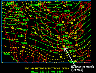
Isotachs are lines that connect points of equal wind speeds on a surface. The closeness of the lines of the isotachs correlates to how intense the wind speeds are. this is a map of the United States that shows heights and isotachs.
Isobars
www.newmediastudio.org/.../Closed_Isobars.html
An Isobar is a line that is drawn on a weather map to connect points of equal pressure. This map displays close isobars around a low pressure cell. Isobars are a way to describe air pressure.
Tuesday, November 4, 2008
Lidar Map
www.csc.noaa.gov/products/nchaz/htm/intro.htm
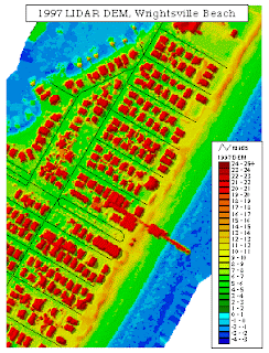
Lidar data is remotely sensed data that is detected using Lidar equipment. They are usually collected with mounted laser on aircraft's and can document topographic change on the land and water below. This is an image over Wrightsville Beach in 1997.
Subscribe to:
Posts (Atom)